| PMC full text: |
|
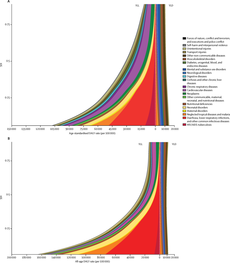
Figure 5
Expected relationship between age-standardised YLL and YLD rates (per 100 000 people) and SDI (A) and all-age YLL and YLD rates (per 100 000 people) and SDI (B) for 21 Level 2 causes
These stacked curves represent the average relationship between SDI and YLL and YLD rates for each cause observed across all geographies over the time period 1990–2016. In each figure, the y axis goes from lowest SDI to highest SDI. The left side shows rates for YLLs on a reflected axis and the right side shows rates for YLDs; higher rates are further from the midline in each direction. Differences in patterns between (A) and (B) is the effect of shifts in population age structure in relation to SDI.
DALY = disability-adjusted life-year.
SDI = Socio-demographic Index.
YLDs = years lived with disability.
YLLs = years of life lost.

