

Why You Might Want
To Switch BrowsersThis section was compiled by Frank M. Painter, D.C.
Send all comments or additions to: Frankp@chiro.org


When I first started working on the Chiro.Org website, I didn't know anything about HTML
(aka hyper text markup language), which is the code that generates every web page.
My friends @ the ORG encouraged me to adopt software programs (early code generators like AOLpress) that would take my text and magically turn it into HTML. What I learned rapidly was that those programs created more problems than solutions, mainly because they made tables look terrible. Tables are the most difficult thing to format (all those columns and rows).
Because much of the serious materials I wanted to render for our site contained tables, I decided to learn HTML code, so that I would have absolute control over exactly HOW it looked.
The leading browser at that time (1996) was Internet Explorer 5, and up until their most recent versions (IE 10 and 11) IE was awesome at displaying tables. You had total control over border colors, border widths and other subtleties that made the work look unique AND interesting.
Below you will find 3 examples of my favorite section,
the LINKS, represented by the 3 most-used browsers...IE11
FireFox and
Google Chrome.
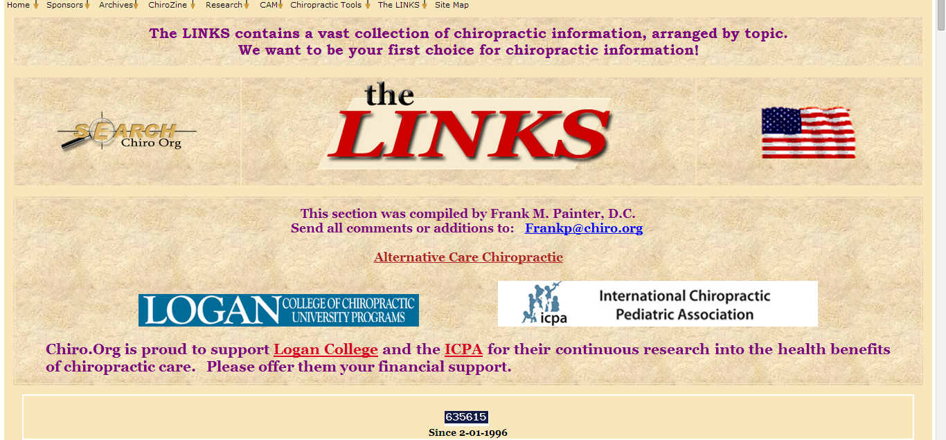
I will list the Chrome example first, since it is the only browser that
renders tables the way I actually designed them to look.
So, here we go. Check out the 3 examples, displayed below:
The LINKS on CHROME
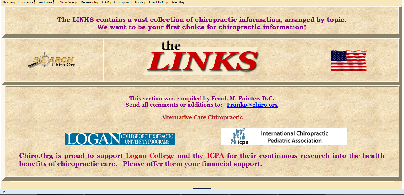
The LINKS on FIRE FOX
The LINKS on IE 11
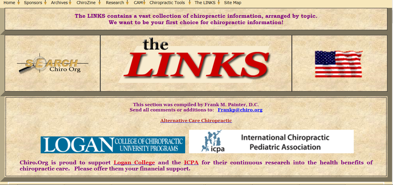
As you can see, the worst offender is Internet Explorer,
closely followed by Fire Fox.
Their border displays are fat and ugly.
More importantly, they DO NOT display what I carefully designed.
Beautiful (Chrome)
Sub-par (FireFox)
Ugly (IE 11)
Whereas the Chrome version maintains the subtlety of my table design, by gently drawing the tan color from the outer border of the page directly into the table, maintaining an overall soft look that accentuates the textured background of each cell (or mini-box) and draws your eye gently to the 3 central graphics (Search, the LINKS logo, and the American Flag), rather than to the UGLY borders.
This second example (FireFox) is half-good, half-bad. The outer border color of the table is maintained (tan color) BUT when they add the top and botton borders of that particular cell, they add a lame “shadow effect” that completely ruins the look I designed into the table. UGH!
The worst offender (IE 11) can't even get the outer border color right. Grrr!
So, although I am NOT a big fan of Google, because they super-commercialized the search engine business, I do have to tip my hat to them for providing the ONLY browser that still follows the agreed-upon conventions of HTML table display, so that web designers can use their skills to the fullest, for maximum beauty and expression.
I rest my case. The rest is up to you.

Return to the LINKS
Since 1-29-2014


| Home Page | Visit Our Sponsors | Become a Sponsor |
Please read our DISCLAIMER |